A well-set page has a quiet surface. The lines end where they should. The spaces do not call attention to themselves. A heading remains with the paragraph it introduces. Much of that calm was made by people handling unruly material: loose letters, metal blanks, proofs marked for correction and pages that had to fit a sheet before the press could touch them.
In hand composition, even the white between words was a physical object. Each printed character was a separate piece of type. So were the spaces that made a line fill its allotted width. A compositor could not simply press a key and let the line wrap; the line had to be assembled at the right measure, held together and made ready to survive its journey from hand to press. A. A. Stewart's 1919 training manual for typesetters spends pages on that work. Its length is a clue: finding the right letters was only the beginning.
Reading the copy before making the line
Joseph Moxon's 1683 account of the compositor's trade says the copy was the worker's authority. Yet he also describes a custom in which an English compositor corrected faulty spelling and punctuation in the copy, and judged where capitals or italic letters helped the sense. He urges authors to mark such choices clearly if they care how they appear. That is a description of a particular historical trade practice, not permission to credit every printer with editing every text. It does show how a clean printed sentence could contain judgments not visible in the author's manuscript.
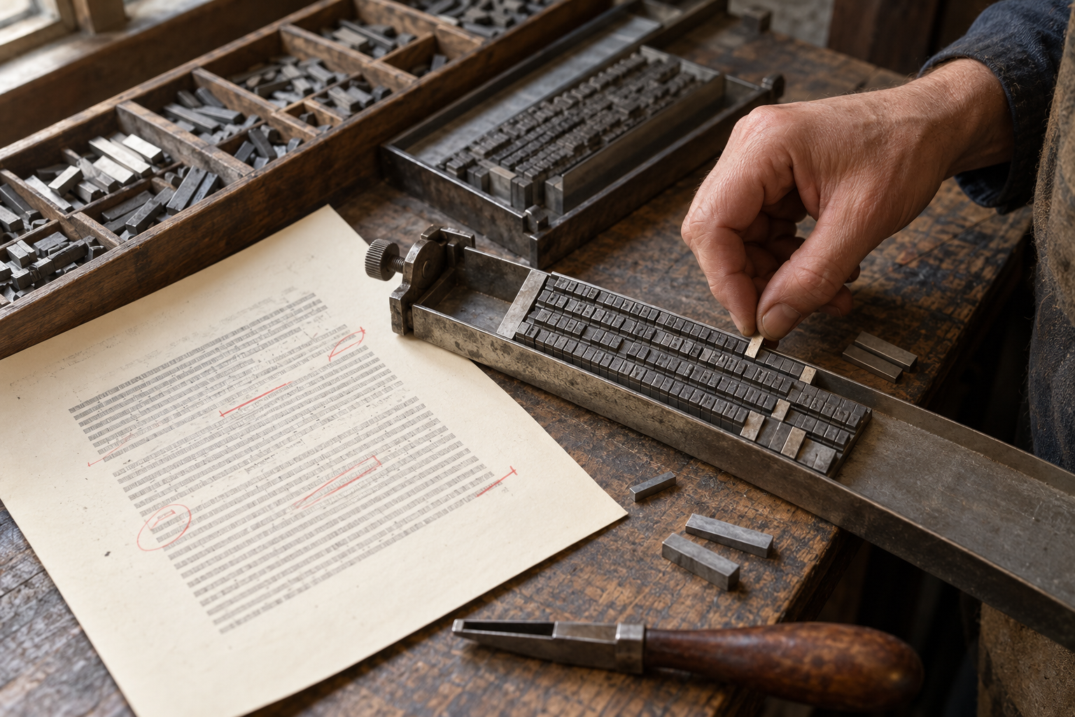
Before setting a page, the shop also needed to know what size of type and width of line the job required. The worker stood at a case divided into boxes of letters, marks and spaces. Stewart explains that the common letters had larger boxes near the compositor's hand, because a case laid out in simple alphabetical order would make a day's work slower. Learning the case meant learning where each sort lived without looking for it anew each time. An empty compartment could halt a line until more type was supplied or type from an earlier job was returned.
The composing stick fixed the line's width. Held in the left hand, it received individual pieces from the right, with the small notch on each piece helping keep the faces oriented. Stewart says an experienced setter read the type upside down as it stood in the stick. This was more than a trick of the eye: a printing surface must be reversed to produce a readable impression on paper. The compositor read ahead in the manuscript while the fingers chose letters, so an uncertain word or missed place in the copy could become a visible error on the page.
Making the blank places work
At the end of a line, the chosen letters rarely occupied exactly the space available. The compositor adjusted the widths between words, or reconsidered where to break a word, until the line was justified: long enough to fit its measure. Stewart gives a practical test. A good line could stand unsupported in the stick, but one squeezed too tightly might damage the smaller type or be difficult to lift out. A line that looked even on paper first had to behave as a stable row of metal.
The visual test was just as demanding. Stewart notes that spaces which look uniform to a reader are seldom all the same thickness. The goal was an even appearance across words and successive lines, without a paragraph that suddenly opened into wide, distracting gaps. The US Government Printing Office's 1894 manual of style goes further: the shapes of the letters at either side can change the amount of white a gap seems to hold. Its instructions ask compositors to consider those shapes and spread extra spacing through a line rather than dump it at one edge. The office warned that one badly justified line could stop a press. Good spacing was an optical judgment tied to mechanical security.
When the stick filled, the worker lifted the set lines into a galley, a shallow tray. Stewart's directions for this transfer specify where the thumbs and fingers should press and how to turn the type while keeping every piece supported. A dropped handful became mixed type that had to be sorted and reset. The page then had to be tied or otherwise held together before proofing. These precautions are easy to miss in the finished book because their entire purpose was to leave no trace.
A correction can travel
The first impression was a proof, not the finished page. A reader compared it with copy and marked errors; the type had to be altered, then checked again. A single wrong letter might be exchanged in place. An omitted word was harder. It could push the rest of a line forward, require new spaces, and send words into the following line. Stewart called that process overrunning. He warns that it could affect several lines or a whole paragraph and that the reset matter needed another reading. A small ink mark in the margin could therefore mean a considerable return to the case.
The Government Printing Office manual makes the divided responsibility plain. It addresses compositors, readers and revisers, and tells workers to report a line that has become scrambled or dropped after a proof was read. The point was to prevent an unnoticed accident from passing through a later stage. In a large shop, no single pair of hands necessarily performed every step. The finished page depended on information moving reliably between people as well as type moving reliably between trays and frames.
Even after its words were corrected, a page was not yet ready for a book press. Thomas MacKellar's 1893 printer's manual describes imposition: arranging pages on the stone so that, after printing on both sides and folding the sheet, they would appear in reading order. A page numbered one might need to sit beside the last page of its sheet. The layout also had to leave the right margins and be locked firmly in a frame. The reader turns pages in sequence; the printer prepared them out of sequence to make that possible.
Nor did the work end when the impression dried. Movable type was a stock of reusable pieces. Stewart describes cleaning it and distributing each letter, mark and space back to the right box. A wrong piece returned to a case could become the next job's hidden error. The page consumed attention both before and after the short moment when it met the paper.
When a line became a machine's unit
Machines changed the pace and the material arrangement, but they did not remove the need to read and correct. A Linotype operator used a keyboard to assemble matrices for a line that the machine cast as one metal slug. John S. Thompson's 1923 guide to the Linotype keyboard instructs the operator to keep the eyes on the copy, learn the keys by touch and watch for errors. In that system, a faulty cast line could not be repaired by swapping one loose letter; the line was the unit to replace. Thompson still reckoned with the proofreader, even in a guide devoted to speed.
The machine also brought work that had no direct counterpart in a hand-held stick. A 1942 booklet from the Linotype manufacturer warns that damaged matrix sidewalls could leave hairlines between printed characters. It prescribes cleaning the adjustable word-space bands and checking the path through which matrices circulate. These are instructions for that machine and its period, not for every press room. They make the same point as the earlier manuals: a mark on a finished page might begin with a small failure far upstream from the paper.
These manuals record practices from different centuries and shops, not a single universal routine. Together they reveal a persistent part of printing that a clear page conceals. Someone has to decide how words occupy finite space, notice when the material refuses the plan, and check what changed during correction. The reader meets a settled line. The setter met all the ways it could come apart.
A thought worth keeping?